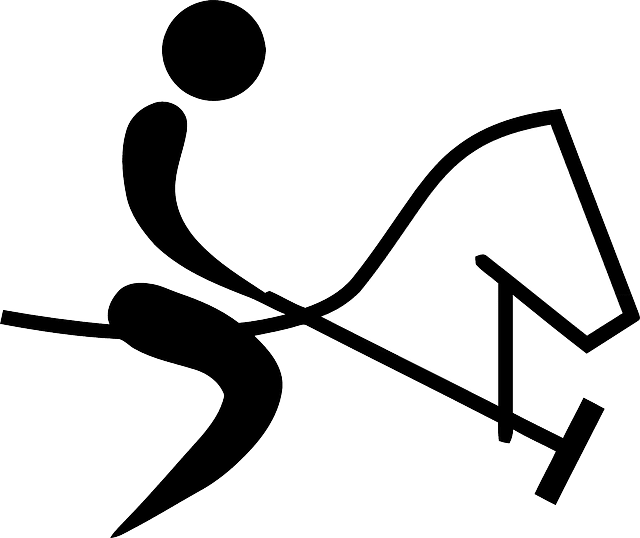
Image credit: Clker-Free-Vector-Images / Pixabay
Tips for Designing a Great Horse Logo
Designing a great horse logo takes complex ideas and crafts them into a simple design. There are numerous resources across the web for building an amazing logo design, but before the first line and shape are drawn, it helps to understand the concepts and processes that go into it.
What Makes a Great Logo?
Providing feeding supplies for your horse may come as common sense, but there’s more to feeding time than just oats and hay.
A great horse logo should follow these five principles: simple, memorable, timeless, versatile, and appropriate.
Simple. It features simple design concepts without being overdrawn.
Memorable. It sticks in people’s minds.
Timeless. It stands the test of time and never goes out of style.
Versatile. It can work across a variety of mediums and applications.
Appropriate. It should be suitable for its intended audience.
How to design a logo
Create a design brief using a questionnaire or an interview with the client.
Research the industry and its competitors.
Reference other styles and designs that have been successful.
Sketch and conceptualize logo designs based on the research for the brief. Sketching helps get the ideas down before the logo is refined on the computer.
Revise and improve the logo based on the project brief.
Present the top designs to the client that help them visualize the brand identity.
Deliver the files to the client and offer support.
Phase One: Discover
Before designers start making any sketches, they get as much background information about their clients as possible and learn as much as they can about their business. A thoughtful and detailed project brief will provide context and provide insight into the company’s core values and brand. This is the time to dive into the desired aesthetic, as well as the look and feel of the client. The designer is working to shape the brand identity.
Questions to explore with the client
- What prompted the need for a new logo?
- What is the meaning/story behind the company name?
- What values does the client want the brand to express?
- What is the unique character/value of the company?
- What is the target audience?
- Who are the main competitors?
- What are the company’s goals for the new logo?
- What are the client’s top 3-5 brand “role models? What logos inspire them and why?
- What does the client want people to feel when they see the logo?
- Any special requests or deal-breakers?
These concepts are put together in a creative brief that guides the design process.
Phase Two: Explore
In this stage, designers start with the basics and go back to the fundamentals of design such as style, color, and typography. The basic principles of logo design open their minds to fresh ideas and possibilities. Designers may be thinking about color theory and how they want to use it to evoke emotion. They’ll also look at brands across the market and gather intel, and they’ll look at current trends and seek out new ideas in design.
Phase Three: Design
Sketching
The final product will be designed on a computer, but before that happens, designers sketch out ideas on old-fashioned pen and paper. At this stage, the designer will try word associations related to the brand and play around with thoughts or images related to the brand. They will work through an exhaustive round of iterations, so they have plenty of material to choose from.
Types of Logos
A designer will explore the different types of logos depending on the client’s needs. A few options include:
Word mark. Some brands’ company name is the logo and requires an aesthetic topography and legible font. Some examples include Google, Coca-Cola, and Calvin Klein. Word marks work well for short and distinctive business names, and they can help a business develop brand recognition.
Brand marks. This is a symbol, mark, or image that is specific to a company and makes it immediately identifiable. They strip away text from the logo and use a visual to express a feeling, meaning, or message to audiences. Audiences can look at a brand logo, identify the company, and recognize its unique brand. The Nike swoosh and Target bullseye are great examples of brand logos.
Letter mark. Also known as a monogram, a letter mark is a combination of a company’s initials. It can be a useful style for companies with long names, and it utilizes creative typography.
Design software
Once the designer has created a variety of workable drafts, they’ll narrow it down to its top selection and take the design on the computer. Popular design software includes Adobe Illustrator, Inkscape, Vectr, and Canva Logo Maker.
Phase Four: Refine
When designers have workable solutions, they’ll need to look at the logo from all angles and smooth over any rough edges. They’ll adjust the size, color, and typography to refine the image. They will examine whether the logo is simple, memorable, timeless, versatile, and appropriate. Then, they will refine and enhance the logo.
Phase Five: Define
A great horse logo should be on brand and effective in any context. In this phase, designers test the logo by positioning it with different colors and backdrops. They apply it to different mediums, from its smallest iteration on a phone screen to its largest on a billboard and critique its effectiveness. With this, they will create a style guide as well as branding materials for the client to use with the logo.
Great logos express complex ideas in a simple way. Logos take all the essential ideas that make up brand identity and use design concepts to express those ideas visually. Following these steps will result in a great horse logo for any brand.


